Revisiting a tennis courts booking website to make it more engaging and efficient
Why chosing tennis.Paris.FR?
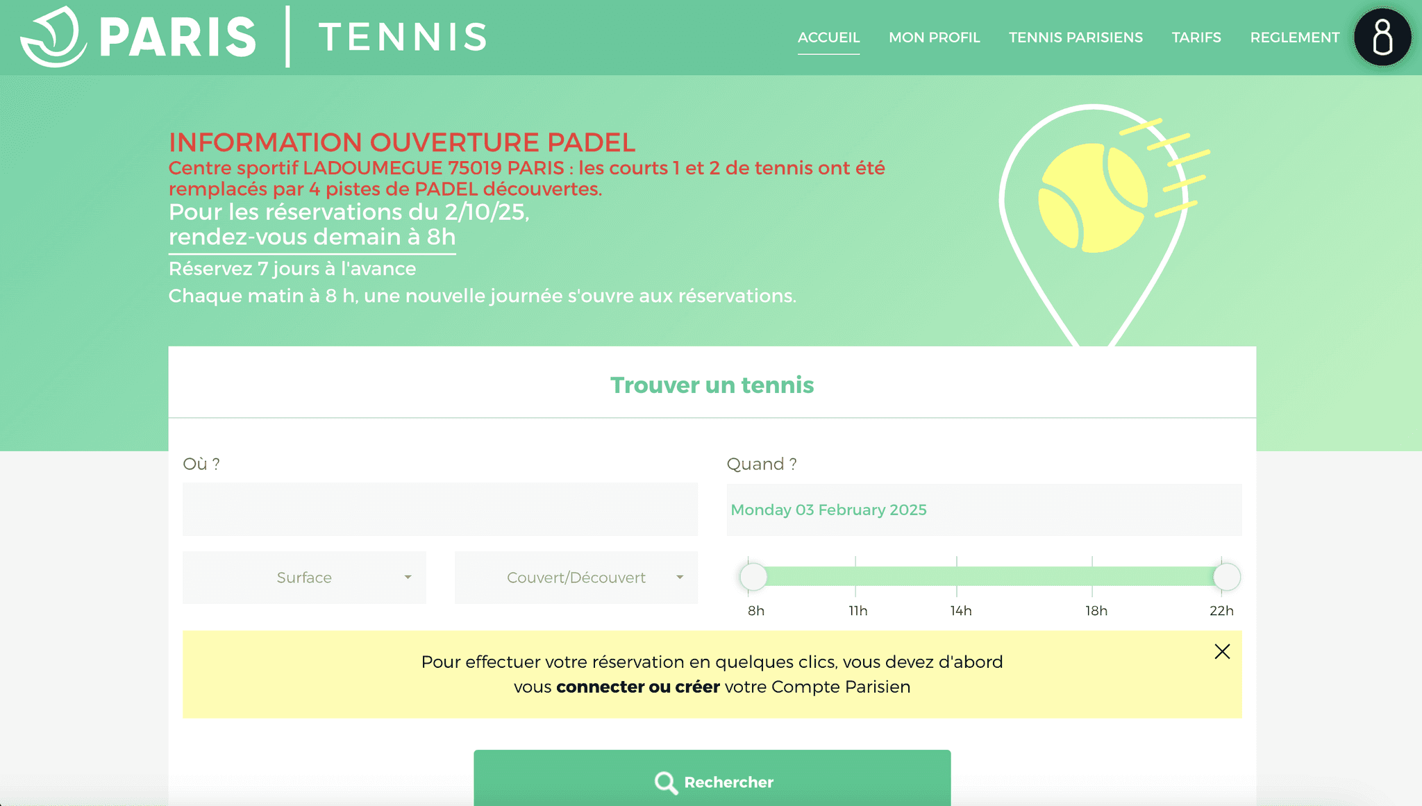
The Paris Tennis website allows Parisians to book tennis courts at clubs listed by the city of Paris.
I've been using the site for a few months now (about 1 connection a week), and I've noticed that there are a few frustrating aspects to booking a court, so I wanted to improve it and suggest a redesign of the process.
To be noted, it's a personal project I conducted, I was not in touch with anyone from the Tennis Paris team.
AUDITING tHE website
I began by identifying, at each stage of the booking process, the various elements that could pose a problem, basing my analysis on the heuristic rules.
I was able to see that there was sometimes :
a lack of context for the information requested,
there was not always consistency in the elements displayed,
and the navigation was not always intuitive.
COMPETITIVE ANALYSIS
I then studied the Ten'up and Google Maps websites to identify best practices that could be used to optimise the user journey, particularly in the maps and time slot booking sections.
THe IDEATION PHASE
I also carried out a brainstorming session, using a Crazy 8s* workshop, to come up with ideas for optimising the user experience. Here are a few of them:
Interactive map on Desktop and mobile
Displaying the steps to increase visibility
Improving contrast for better legibility
Simplifying slot selection
Suggestions for improvement
Existing/optimised user journey
Inscription et authentification via site externe
Profil
(mes coordonnées)
Let's get in touch
Made with ❤️ and 💦
Mathilde Sampré© 2025 . All rights reserved.
I'm proud this website has an eco index of 82/100