Scope and objective of the challenge
During the UX/UI bootcamp, I participated to a UI challenge of 21 hours during which each of the students were asked to redesign a mobile app of their choice.
The objective was to choose 3 screens from this app that would be the most relevant to redesign in terms of user flow.
Why choosing Goodreads?
I decided to work on the Goodreads app as I’ve been using for a few months now, to discover books, add them to a virtual bookshelf, set up book challenges and exchange my readings with friends.
I first focused on doing a heuristic analysis of the 3 screens of the app I felt I could improve:
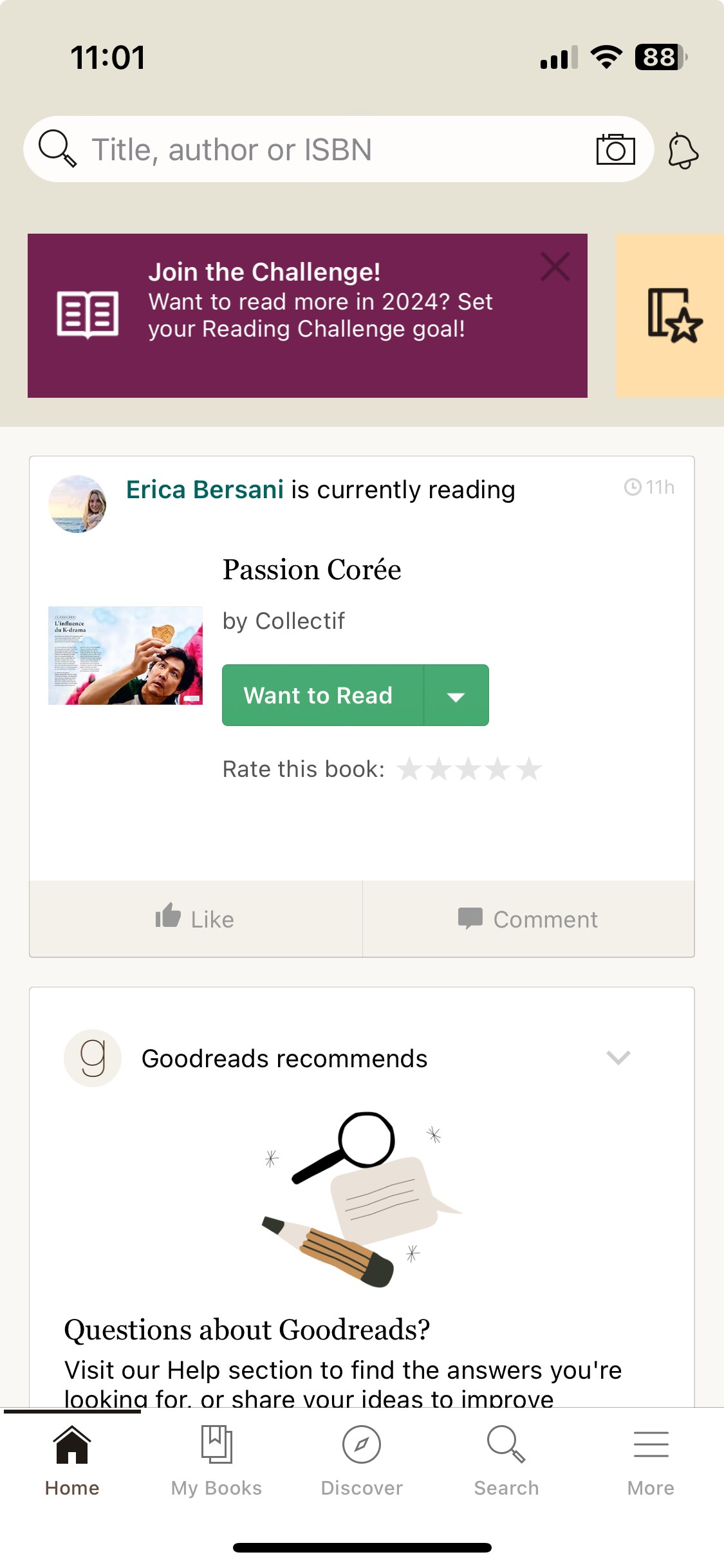
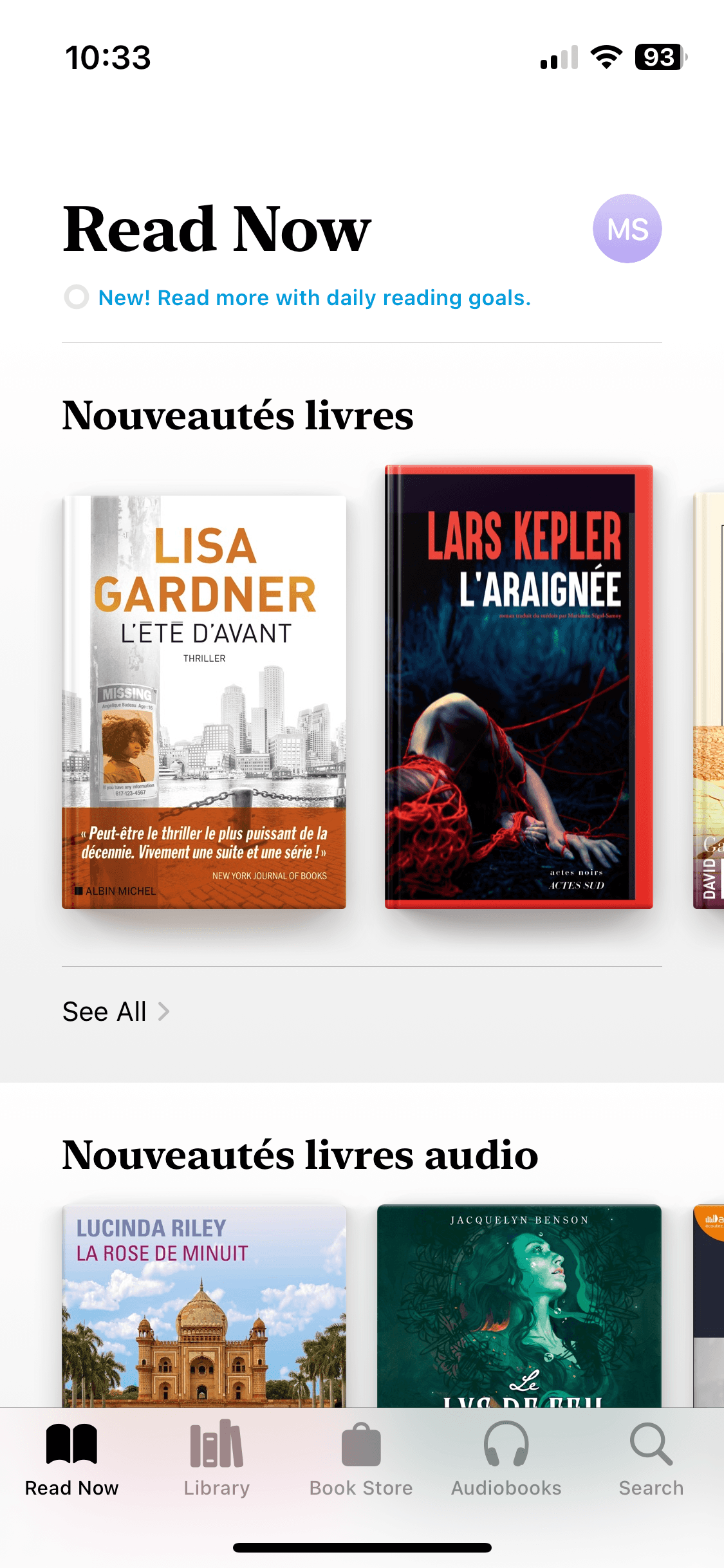
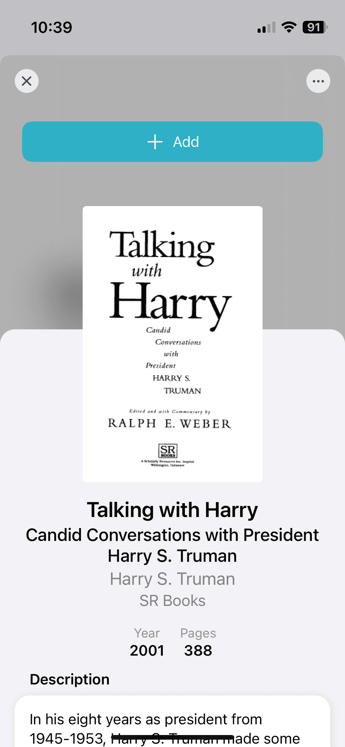
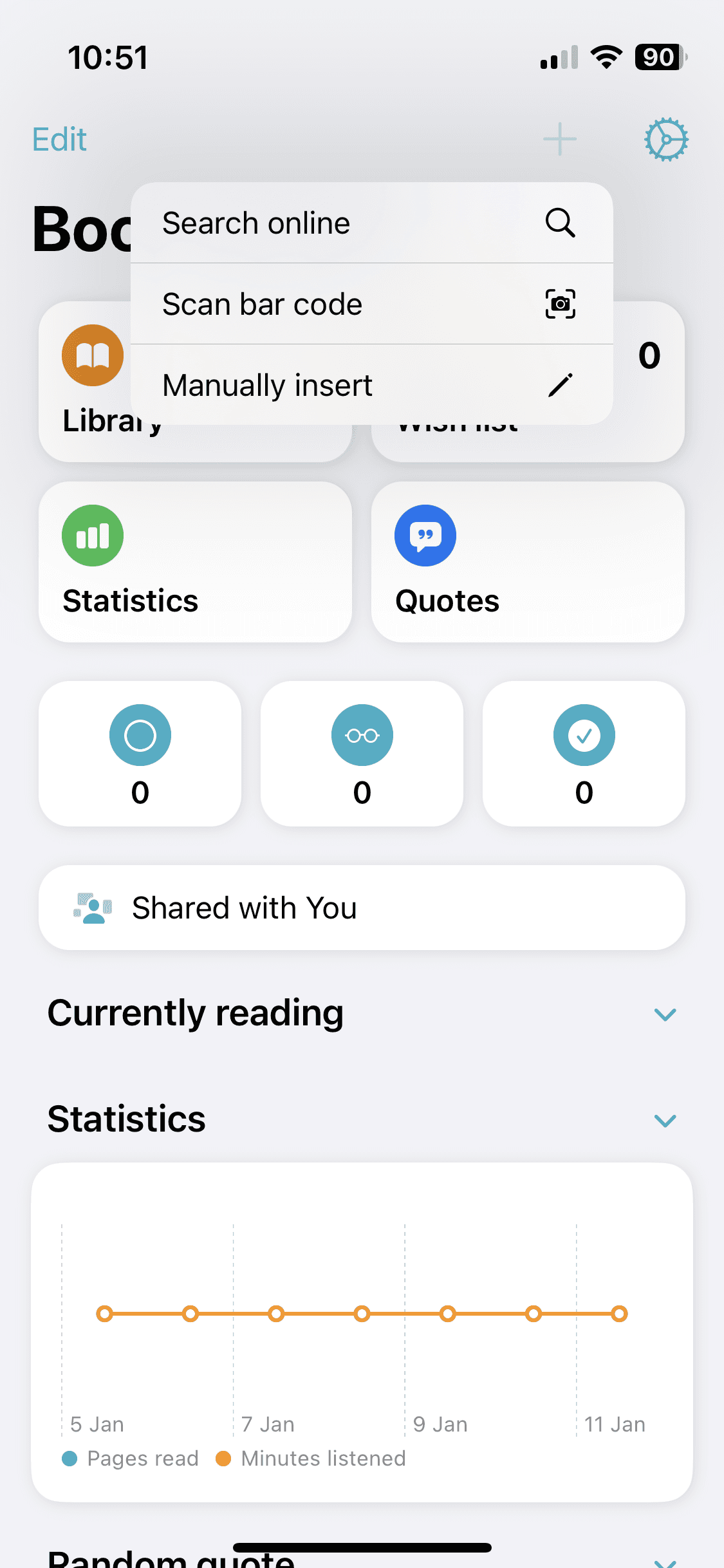
the home page,
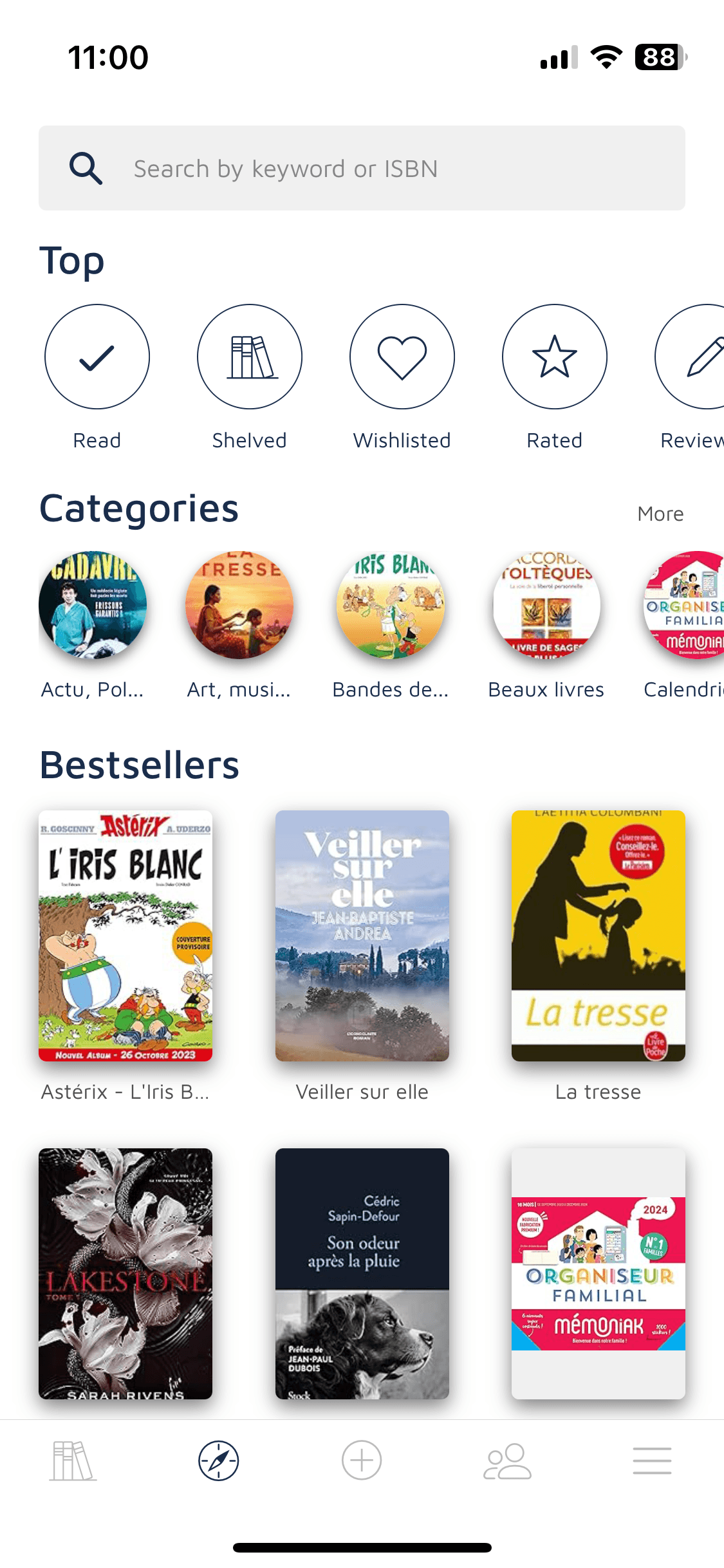
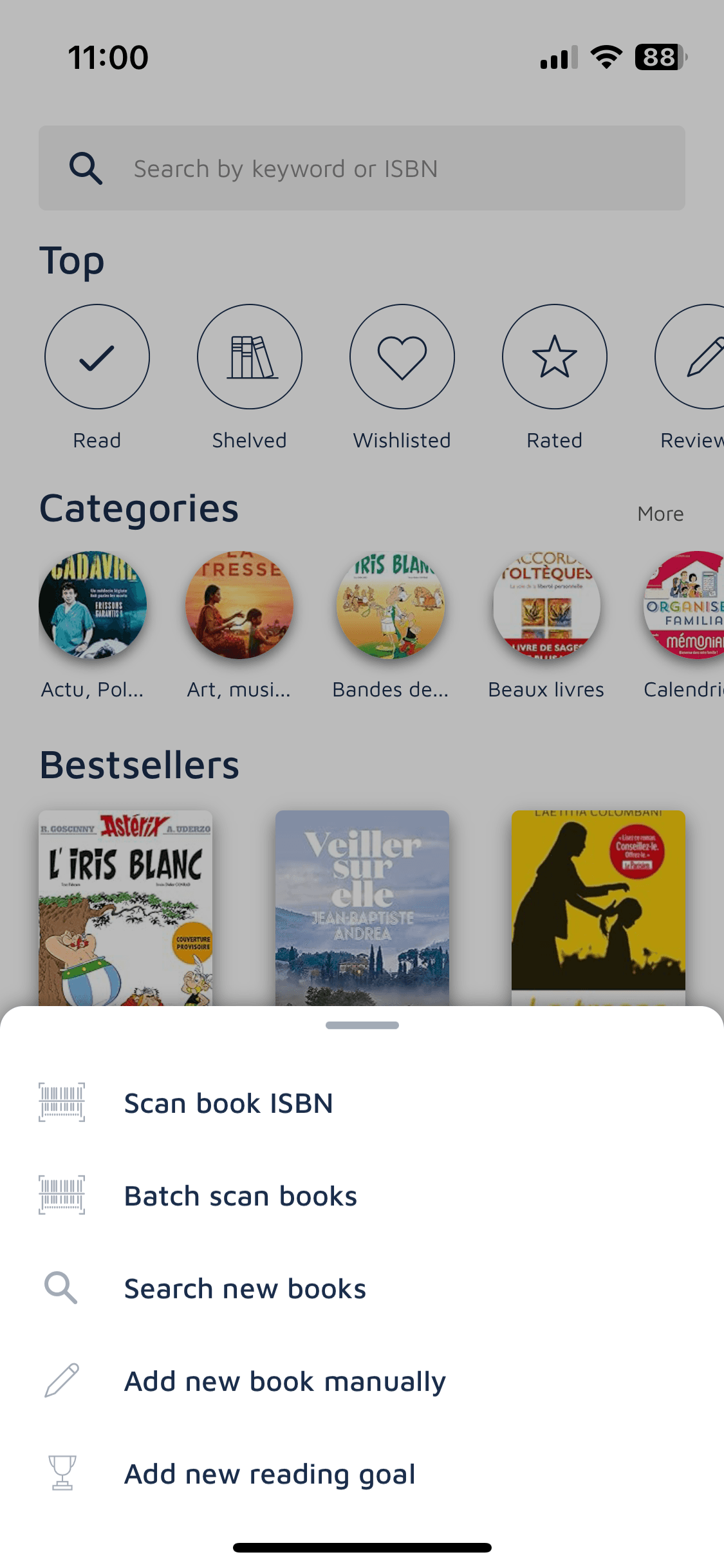
the search page
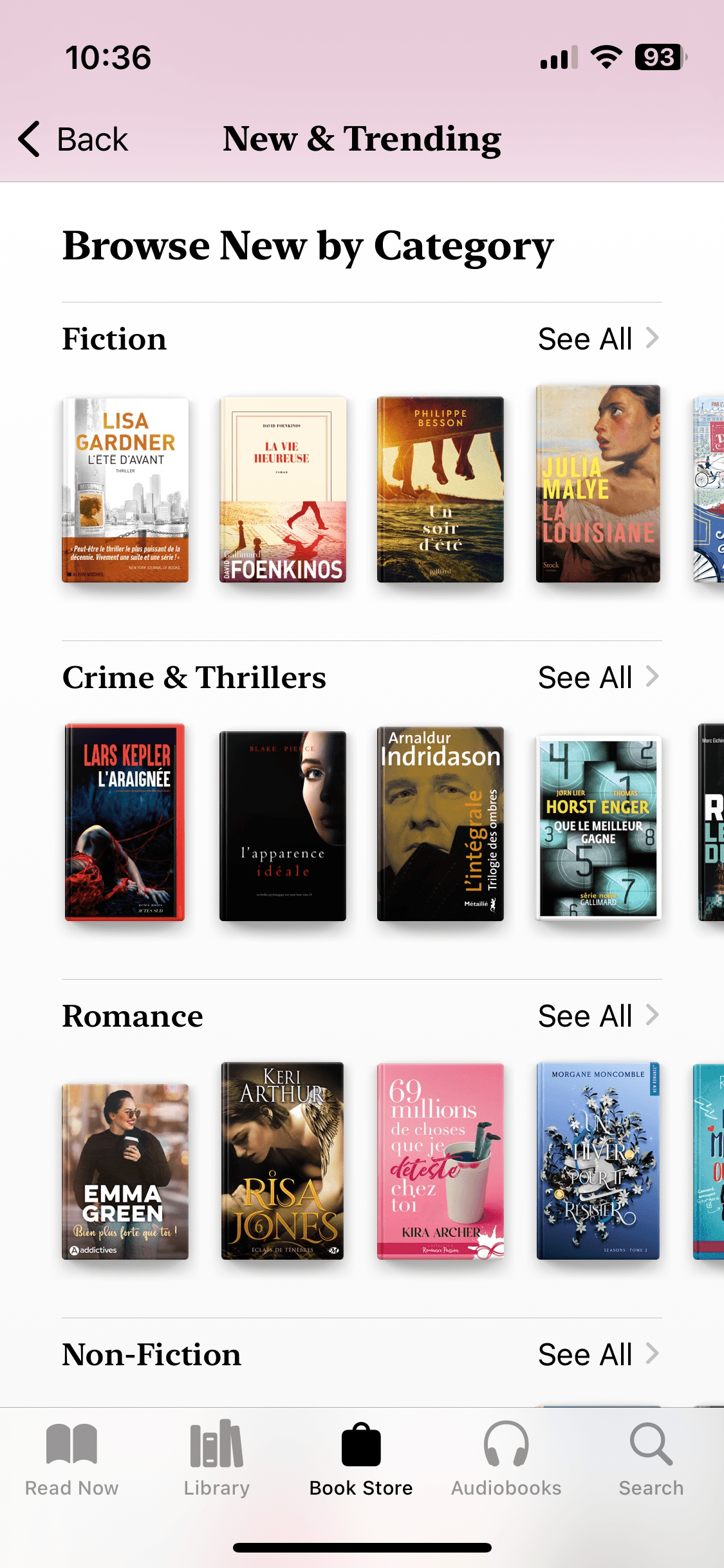
a recommendation page accessible from home.
I identified several elements that deserved to be reviewed : buttons, colors, icon spacing, content structure, etc.
Therefore, I got first ideas of how I could redesign the screens to make them more appealing and engaging for the users, and also easier to use.
Stepping into the challenge
The next step was dedicated to cloning the selected screens into mid-fidelity prototype. This part, focusing on analysing the current mobile app screens, identifying the elements to improve, and building the mid-fidelity wireframe clone, took me around 6 hours in total.
Then came the part where I did the visual competitive analysis, defined the brand attributes I wanted for the new design and the moodboard to create the branding.
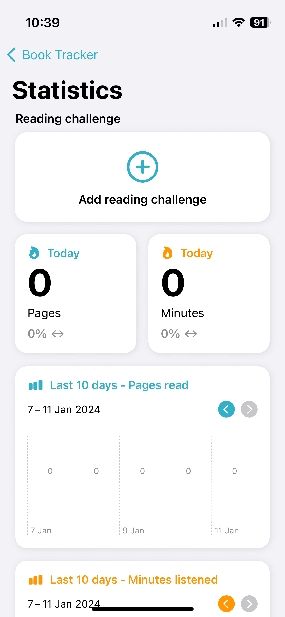
Working on the competitive analysis was pretty insightful. I decided to select the 3 following mobile apps: Apple Books, Book Tracker and Bookshelf.
Apple books app
Too much purchase oriented
Too much performance oriented
Defining the branding
Running this competitive analysis helped me refine the redesign priorities for the app, which led me to define the brand attributes : literature-addict, serious, functional, sharing, and calm. That is what I wanted the redesign to convey.
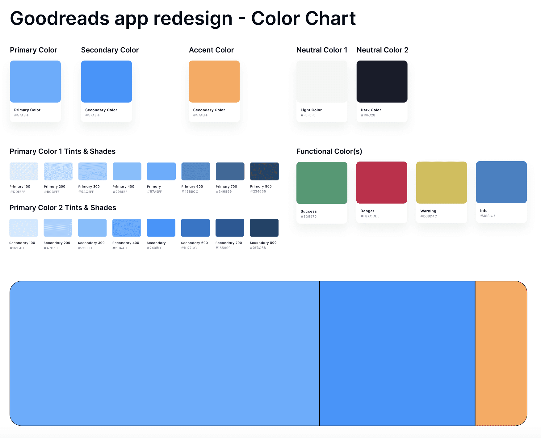
The color selection came quite easily, I naturally selected blue as the primary and secondary colors to convey a sense of calm and seriousness. Then I chose a vitaminic orange for the accent color to make it dynamic.
For the font selection, I wanted users to identify quickly the app was book-related, so I chose a font similar to the one used in the books. I picked Georgia for the main headings and since I aimed to modernise the app, I selected a secondary typography, called Nunito Sans, for the body text and the secondary titles.
This analysis and branding definition part took around 3 hours in total and allowed me to jump into the high-fidelity wireframing, honestly the most exciting part! :D
Wireframing the high-fidelity prototype
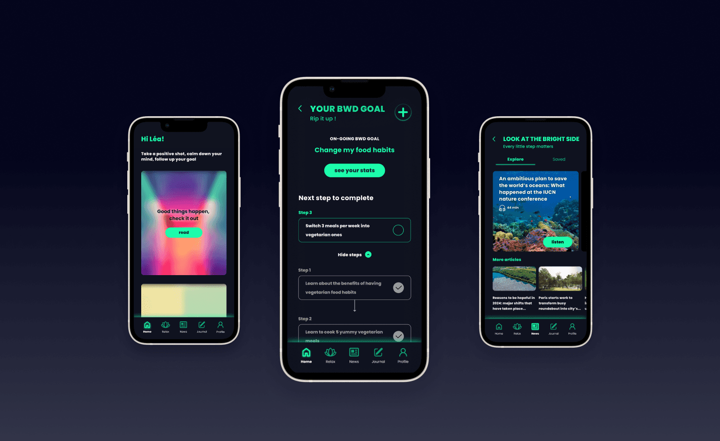
Here’s the final result of the screens that took me around 12 hours to design
Here’s the video demonstrating the 3 screens
Here’s the video demonstrating the 3 screens
Globally, I introduced a lighter background and colored the main buttons and tags with primary and secondary colors.
Globally, I introduced a lighter background and colored the main buttons and tags with primary and secondary colors.
Globally, I introduced a lighter background and colored the main buttons and tags with primary and secondary colors.
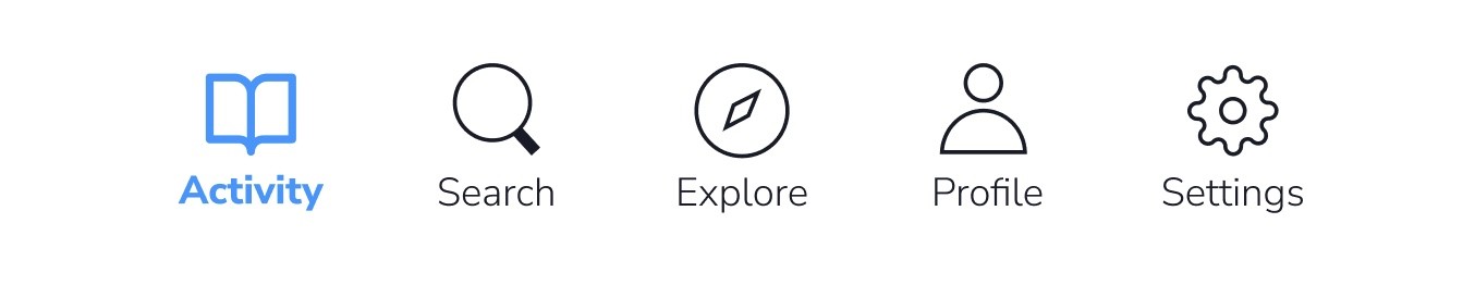
The navigation bar : I redesigned the pictos and make them clearer. I found the “more” option in the current version was not corresponding to the content behind (dedicated to profile settings, recommendations, etc) so I replaced it with a settings icon. I also added a micro-interactions on the icons (see “Activity” and “Search” in the demo video) to make them more visible.
The navigation bar : I redesigned the pictos and make them clearer. I found the “more” option in the current version was not corresponding to the content behind (dedicated to profile settings, recommendations, etc) so I replaced it with a settings icon. I also added a micro-interactions on the icons (see “Activity” and “Search” in the demo video) to make them more visible.
The navigation bar : I redesigned the pictos and make them clearer. I found the “more” option in the current version was not corresponding to the content behind (dedicated to profile settings, recommendations, etc) so I replaced it with a settings icon. I also added a micro-interactions on the icons (see “Activity” and “Search” in the demo video) to make them more visible.
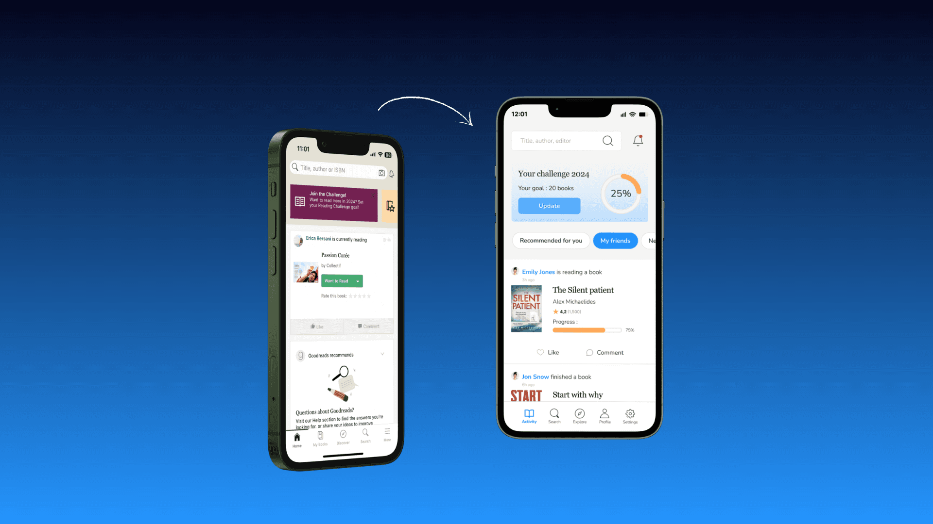
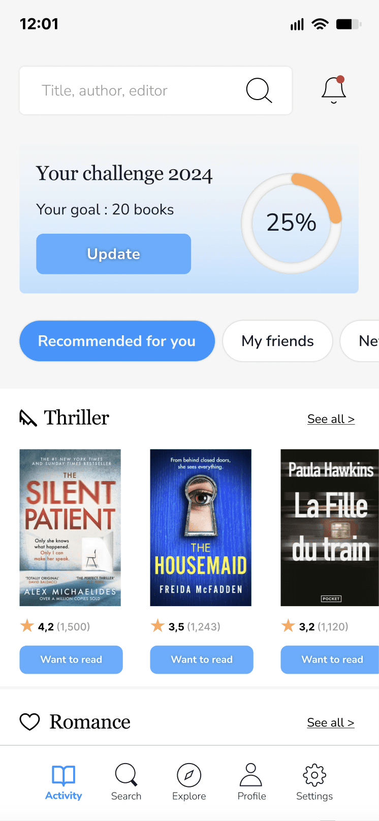
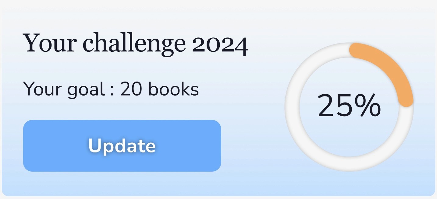
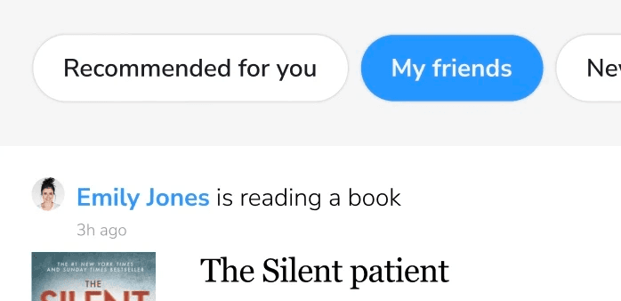
The home page : I decided to highlight more the book challenge part. Indeed, on the screenshot of the current home page (see higher), there’s a card inviting the user to join a book challenge but the fact is I had already setted up a challenge on my profile. So I wanted to make it more visible on the home page so that the user has a reminder of it when they open the app and can get motivated to progress on it. I also integrated a micro interaction on the progression ellipse completion.
The home page : I decided to highlight more the book challenge part. Indeed, on the screenshot of the current home page (see higher), there’s a card inviting the user to join a book challenge but the fact is I had already setted up a challenge on my profile. So I wanted to make it more visible on the home page so that the user has a reminder of it when they open the app and can get motivated to progress on it. I also integrated a micro interaction on the progression ellipse.
The home page : I decided to highlight more the book challenge part. Indeed, on the screenshot of the current home page (see higher), there’s a card inviting the user to join a book challenge but the fact is I had already setted up a challenge on my profile. So I wanted to make it more visible on the home page so that the user has a reminder of it when they open the app and can get motivated to progress on it. I also integrated a micro interaction on the progression ellipse.
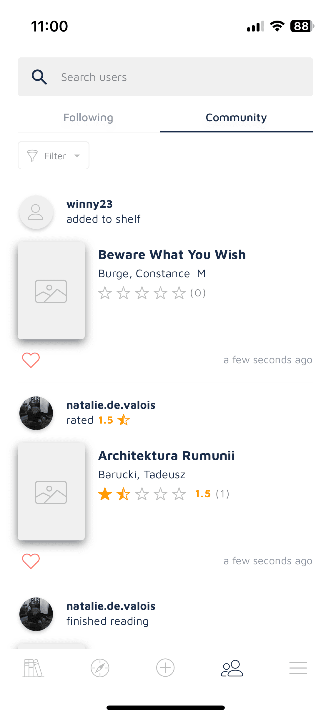
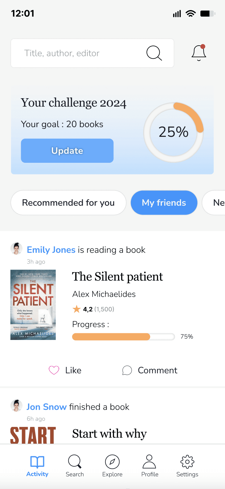
The activity feed : I felt the content was too mixed up with either recommended books, or friends’ activity. So I decided to structure it better and introduce category tags to allow the user filter the content, depending on what they would like to see: recommended books, friends activity, new / trending books and best sellers.
The activity feed : I felt the content was too mixed up with either recommended books, or friends’ activity. So I decided to structure it better and introduce category tags to allow the user filter the content, depending on what they would like to see: recommended books, friends activity, new / trending books and best sellers.
The activity feed : I felt the content was too mixed up with either recommended books, or friends’ activity. So I decided to structure it better and introduce category tags to allow the user filter the content, depending on what they would like to see: recommended books, friends activity, new / trending books and best sellers.
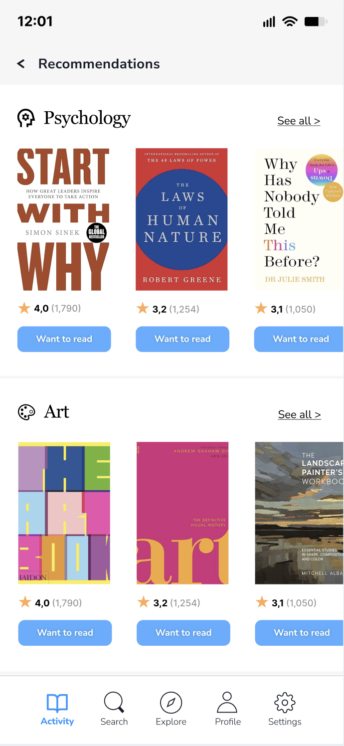
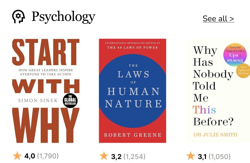
The recommendations screen : I chose to make the genre categories clearer and created sections with a book selection of the given genre and the possibility to see all books from this genre. Then, I simplified the rating render and gave users an indication of the global rating and the number of votes.
The home and the recommendations screens : I chose to make the genre categories clearer and created sections with a book selection of the given genre and the possibility to see all books from this genre. Then, I simplified the rating render and gave users an indication of the global rating and the number of votes.
The recommendations screens : I chose to make the genre categories clearer and created sections with a book selection of the given genre and the possibility to see all books from this genre. Then, I simplified the rating render and gave users an indication of the global rating and the number of votes.
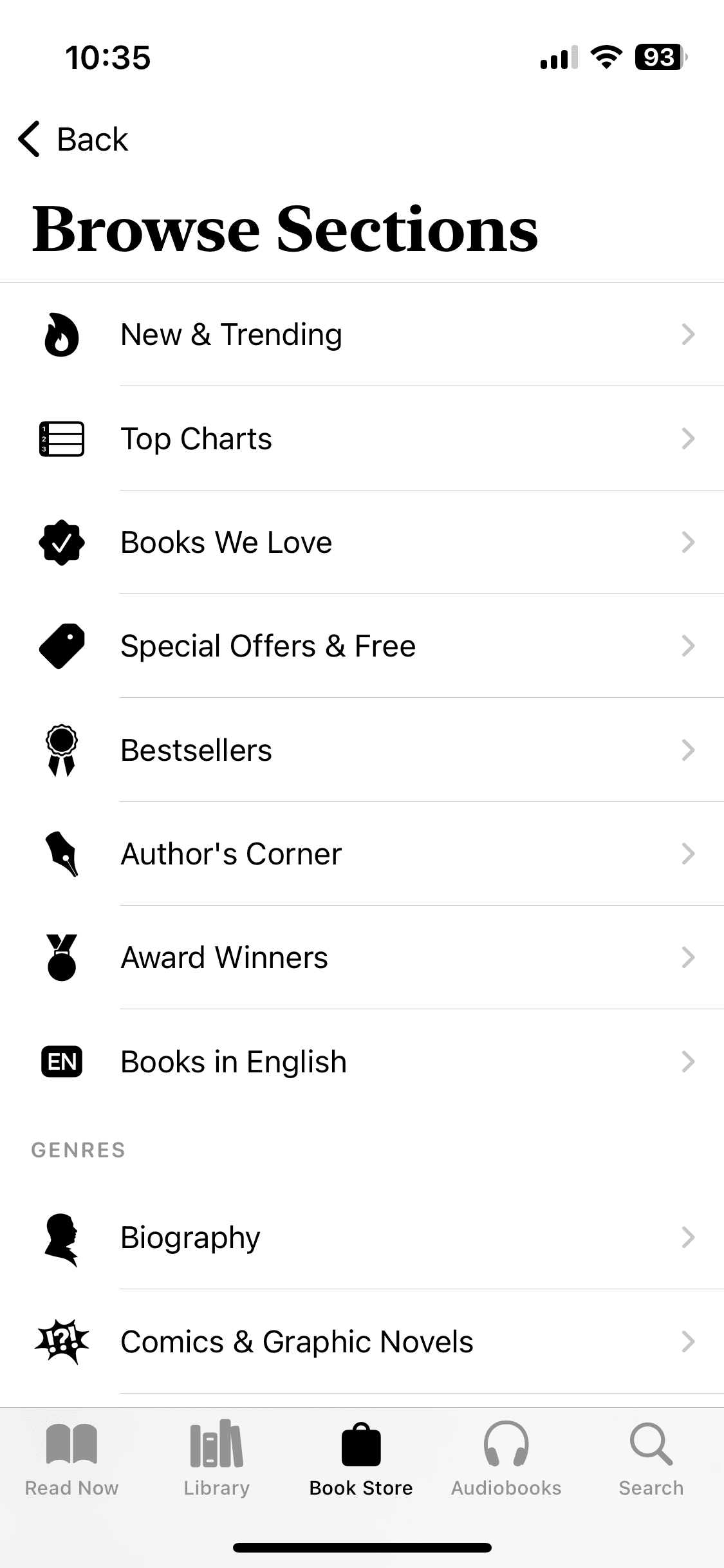
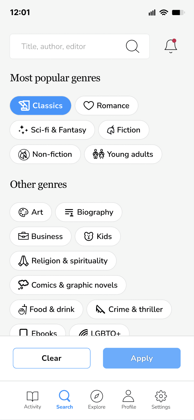
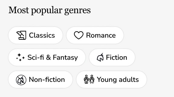
The Search screen needed to be more engaging and I decided to create genre tags with pictos to make it easy to identify, and decided to introduce a filter option so that the user can select several genres and see the corresponding book results.
The Search screen needed to be more engaging and I decided to create genre tags with pictos to make it easy to identify, and decided to introduce a filter option so that the user can select several genres and see the corresponding book results.
The Search screen needed to be more engaging and I decided to create genre tags with pictos to make it easy to identify, and decided to introduce a filter option so that the user can select several genres and see the corresponding book results.
Following this work, I went through a design critique session with other teammates and got interesting feedback. Someone told me that it would be great to add some rythm in the home page, which I agreed on, so I decided to integrate a blue color on the challenge card to make it stand out more. Apart from this comment, everyone said the design was clear, organised and easy-to-use.
Following this work, I went through a design critique session with other teammates and got interesting feedback. Someone told me that it would be great to add some rythm in the home page, which I agreed on, so I decided to integrate a blue color on the challenge card to make it stand out more. Apart from this comment, everyone said the design was clear, organised and easy-to-use.
Following this work, I went through a design critique session with other teammates and got interesting feedback. Someone told me that it would be great to add some rythm in the home page, which I agreed on, so I decided to integrate a blue color on the challenge card to make it stand out more. Apart from this comment, everyone said the design was clear, organised and easy-to-use.
Key learnings from this UI challenge
I really enjoyed practicing my UI skills in such a short time, I found it very stimulating. I realised how much I learnt since the bootcamp started and how much I need to keep practicing to sharpen my abilities in Figma.