Helloasso page form redesign
The brief
In the final project of the bootcamp, I worked with another teammate with Helloasso. This company a key player in the association field and it provides to the associations a platform on which they can manage their fund campaigns, their ticketing operations, etc.
HelloAsso asked us to redesign the form present on the page creersonassociation.com to make it more user-centric and engaging.
The global objective being to convert more users who create their association offline, to do it online, through their form.
The research
We looked at the association market to understand it better and get an overview of the context. We found these figures:
active associations in France
associations created in 2022-2023
of associations run by men
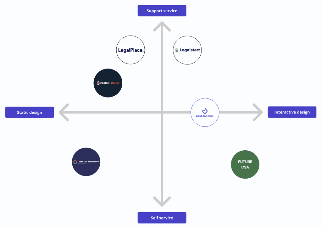
We also looked at the competitors on the market to see how Helloasso's service "créer son association" was positioned and we defined the brand positioning below :
We also did a qualitative research by interviewing 4 persons who already created an association in the past. We notably learnt these key insights :
"We'd like
some kind of streamlined, simple, straight-forward form".
Frida, 24 yo
"I had to start a new form because my progress had not been saved".
Ludivine, 23 yo
The user persona
Following the research phase, we gathered all the insights we found and this helped us define this user persona :

AGE
36
OCCUPATION
School teacher
STATUS
Married
LOCATION
La Séauve-sur-semène
“I like to bring people together around convivial events.”
New to forming association, clueless on needed docs.
Hates paperwork, loses patience fast.
Short on cash, reluctant to spend on association setup.
Loves cinema, eager to unite locals, no cinemas nearby.
He wants to be reassured about the steps to follow.
Eager to launch association quickly.
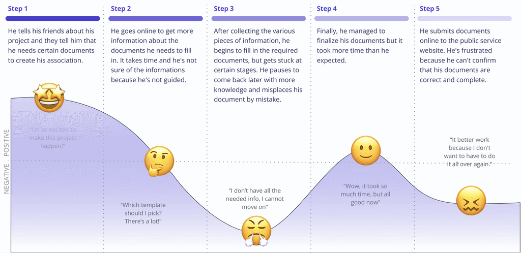
The user journey map
Understanding the journey users experience when creating an association, we built the Committed Charles user journey:
The problem statement
The ideation
To find ideas of features, we used the Crazy 8s and the Round Robin methodologies. This allowed us to prioritise the key features for this redesign project:
Onboarding screens
More simplified buttons
Automatic saving
State indicators
Global progress bar
Encouraging message
Visibility on the next steps
The wireframing
We started to test the concept of the form we thought of. We presented it to 5 users who raised comments mainly on this screen :
Should I create an account?
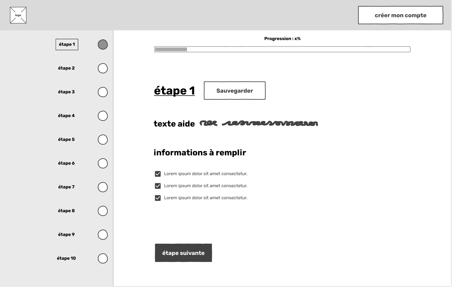
Taking into account the feedback, we designed the mid-fidelity wireframe and tested it again with 5 users. This time, the page following the download of the documents received the most comments :
I feel the illustration is a bit old school
No visibility on the step name
Very formal design
Confusing colour choices
Encouraging message
Easy way to subscribe
Clear visibility on the steps
Engaging design
More information not visible enough
This analysis enabled us to refine the elements we wanted to include in the redesign. We decided to modernise the primary buttons, introduce illustrations to make the form more warm and integrate a progression bar with encouraging messages to make the form more friendly.
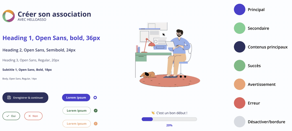
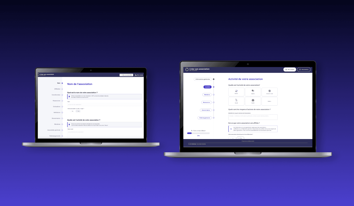
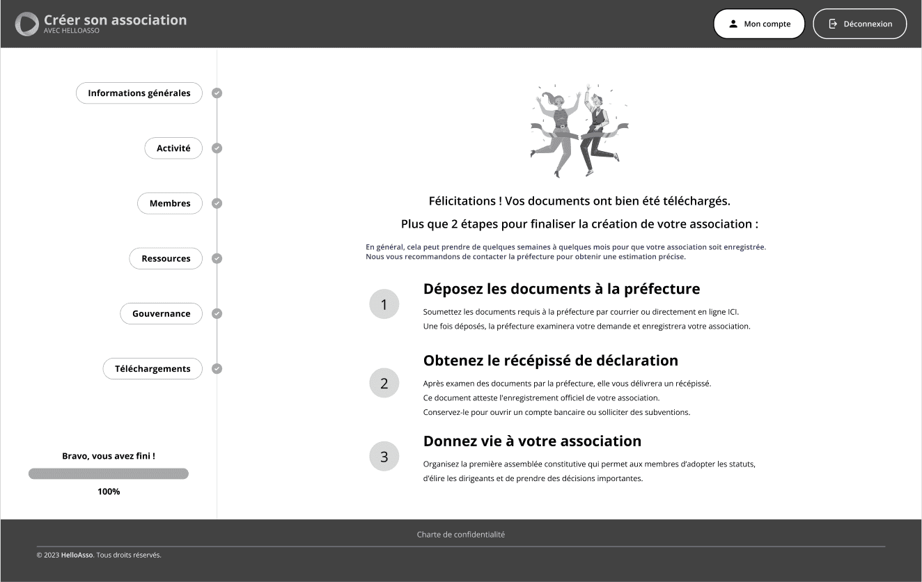
The result
Here's the demo of what we came up with after all the design thinking process : onboarding screens to tell the users what to expect, a cleaner interface with less steps, a better visibility on the form completion, and encouraging messages to fill out the form quicker.
Let's get in touch
Made with ❤️ and 💦
Mathilde Sampré© 2025 . All rights reserved.
I'm proud this website has an eco index of 82/100